Zach Hink, my colleague and a designer here at WerkPress, wrote a great piece recently about the current shift in web design from a skeuomorphic, intricate approach to one that is flatter, restrained, and more suited to the myriad mobile devices that people now carry around with them every day. I thought that it would be valuable to piggyback on that topic and explore how that shift should change the relationship between web designer and developer.
Allow me first, if you will, to indulge in a bit of history. In the early days of graphic design before “digital” was a thing, designers worked in concrete dimensions: 8.5 x 11 inch pieces of paper; 5.5 x 8.5 inch book covers; 24 x 36 inch posters. Control of the final product’s ultimate size meant that, printing issues aside, it would closely match the designer’s vision.
The emergence of the world wide web in the early 1990s presented designers with both new challenges and new possibilities. Positively, the web’s flexibility made it possible for designers to present content in ways never possible in print. That flexibility could be a negative, as the differences in computing environments and browser support often led to user experience that varied from person to person. To deal with these challenges of technology and transition, designers responded as one would expect: they took techniques from their previous experience in print design and adapted them to the web. This led to the creation of lots of a web sites that looked suspiciously like a piece of paper: fixed-width, sharply delineated containers of 960 pixels or so with elements placed at exact coordinates within.
By the mid- to late–2000s, design tastes and web technology had evolved from simple images and “web” fonts to elaborate, ornate designs full of gradients, shadows, textures, and beveled edges. Although these designs could, in theory, stretch to fill larger monitors, many of their component parts (including text, unfortunately) were built using images and content was still often restricted to a fixed-width container. See some examples below:


During the aforementioned time periods, designers had most of the power in their relationships with developers. The Photoshop design was sacrosanct; developers were tasked with building the final product to look exactly like the .PSD file, web standards and their sanity be damned. Developers were, in many ways, secondary in the process.
In the last few years, however, something unexpected has happened: mobile devices have, with increasing speed, replaced traditional desktop and laptop computers as the average person’s web-browsing device.
Designers have responded to this trend by discarding those bold gradients, dramatic drop-shadows, and busy layouts in favor of cleaner, simpler, typographic-driven designs that look good on mobile devices. Consider these examples:


This shift in design sensibility and usage patterns by end users has also changed the meaning of “good” design and user experience. A gorgeous design produced on a gigantic, 2500-pixel wide display isn’t worth much if an average user is using a three-inch touchscreen. And size isn’t the only differentiator; with a smaller, touchable display also comes a user’s expectation of increased interactivity and easily consumed content.
With these changes must come a change in workflow; in this new era of tiny but powerful devices, the key to creating memorable experiences on the web is collaboration between designers and developers.
Rather than taking a fully-realized Photoshop comp and building it as they have done for the past 15 years, developers need to be involved in a project from the beginning, from the earliest brainstorming, through design and onto completion. The concept of development as the mere executor of the designer’s grand visions isn’t just outdated, it’s a terrible waste of resources and talent.
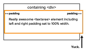
Our development toolkit has expanded dramatically over the last ten years. With the popularity of GitHub, open-source tools are the rule rather than the exception. HTML5, CSS3, jQuery, Bootstrap, LESS, are just a few of the many tools now available for free to web developers to use in creating great experiences on the web. Powerful as these technologies are, it is difficult — if not impossible — to shim them into a project if they aren’t considered early in the design process.
Thankfully, there are signs everywhere — even here at WerkPress — that the long-standing wall between design and development is falling. Designers are learning how to code. Developers are creating UI/UX wireframes. In a word, it’s collaboration.
And the quality of the things we make can only improve as a result.