
It’s amazing how easy it is to be frustrated repeatedly by a technical issue without realizing there has been a simple solution available for years.
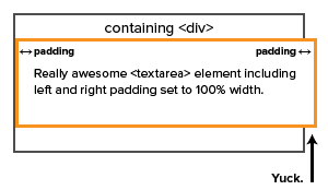
In this case, I’m writing about a common CSS problem, specifically when you would like to add padding or a border to an element but have that element stretch to fill 100% of its container. The traditional box model includes interior padding and a border in an element’s width, so if you added padding to, for example, a textarea element and set the width of that element to 100%, it would stretch outside its containing element. Very frustrating.
Enter the CSS3 spec’s box-sizing property. If you set this property value like so:
{ box-sizing: border-box; }
. . . the affected element will fill its containing element without overflowing the parent’s boundaries. Neat.
I’ve dealt with this issue in various projects for years by hacking element widths as necessary, assuming that it would always be a limitation of the box model. Turns out it’s not, at least not anymore. Technology changes, and the world we live in evolves. This is especially true for those of us who work on the web, where change seems to be happen almost overnight. One would think that the rapid pace of change in our industry would force us to constantly reevaluate the things we think we know, but as the above example shows, it’s still easy to become complacent and stuck in old, inefficient ways of working.
I’m finally figuring out that it’s better to think that I know nothing instead of assuming that I know everything.
My advice to you is this: Don’t give up on searching for solutions to long-standing problems, especially the really frustrating ones. There will always be new things to learn and discover about whatever it is you do for a living; if you make a habit of questioning and reevaluating your skills, tools, and methods, you’ll make yourself more valuable as an employee and more well-rounded as a person.
Footnote: For more on the box-sizing property, visit CSS Tricks.